Friday, 22 January 2010

The Art Alpha_bet

 V  is for Vincent Van Gogh

This weekend, the Royal Academy of Arts, London, opens its exhibition 'The Real Van Gogh | The Artist and his letters'. What I will hopefully enjoy the most about this show is exactly the dual experience. The letters of the exhibition title refer to the correspondence between the artist and, mainly, his younger brother.
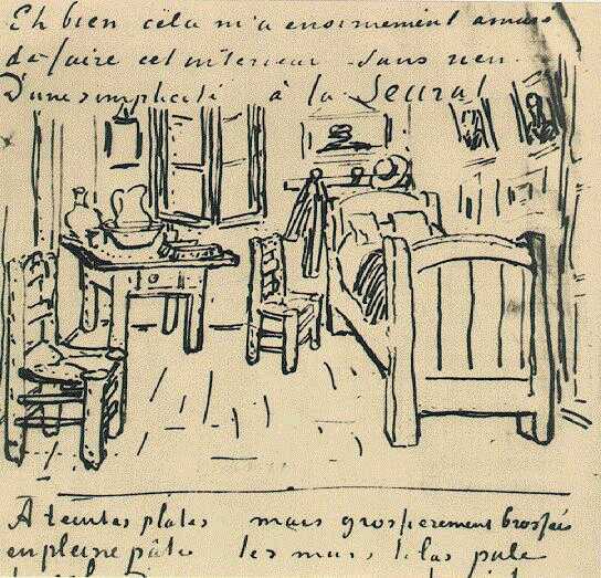


Bedroom in Arles

I always enjoyed to dissect visual things and get to know what is inside, or behind if you prefer, the creator thoughts. I love seeing sketches, plans, roughs, non-approved designs. I find the process itself fascinating. As much as the final piece. In his letters, Van Gogh included several of his studies and sketches that would eventually become masterpieces.


My relationship with Van Gogh was derived from his use of colours,developed during his French period. More precisely, the shock he produced among complementary hues.
"There is no blue without yellow and without orange." is a quote attributed to him. Well, accurate or not the credit, it describes in words the reproduction that adorns my bedroom:


Cafe Terrace at Night

Another piece of his that also warms me up, I learned to like  very much after seeing the real thing in Paris.


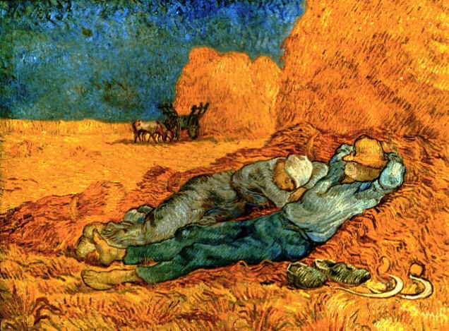
Noon: Rest From Work (After Millet)

Interesting, I see now, more than the portraits or flowers and sunflowers, the works that most attract me have in common subjects such as resting, free time, pause...

References:
http://www.royalacademy.org.uk/exhibitions/vangogh/
http://www.vangoghgallery.com
http://en.wikipedia.org/wiki/Vincent_van_Gogh
http://www.ibiblio.org/wm/paint/auth/gogh/

Wednesday, 20 January 2010

Carpe Diem

The new Diesel ad campaign is stupidly smart.

At first I didn t know what to really think about it but the gorgeous photography, the beautiful colour scheme and the bold typography didn t let it pass by unnoticed. Not to mention the tag line: Be Stupid. Or, BE STUPID, in capital letters scream. Or, if you prefer, a capital letter wake up call.

Of course most of the situations depicted are extreme examples of stupidity. And that is actually the beauty of the campaign: the humour. It made me smile and I am sure it will make Diesel consumers smile also.

Fashion labels campaigns do not sell clothes ( any Advertisement student knows that ), they sell life styles. And being silly and not taking things THAT SERIOUS is the best way to get through life. In the end, is all dust…


More @ Diesel.

Sunday, 17 January 2010

And now? or Are my heros dying of overdose?

Today I read this post and I confess it disturbed me a little. Then I looked up for the author and that shacked me. It was blogged by Rick Poynor, aka the very own founder of eye and Designer Observer.

In a nutshell his words are a critique to the way graphic designers in the UK deal with poster as a media. And fail. To all fairness, one has to consider that, as it seems, his opinion target this collection of work sin particular. But, still, it lights up the yellow light.

He goes around a set of poster for the London Design Festival 2009, when a group of high caliber designers were commissioned to design A1 posters to celebrate design in the city.

Some of the posters displays an extreme abstraction of that.

Bibliotheque


Form


Others, somehow made use of cliches quite explicitly (!).


About Creative


Henrik Kubel


Whereas others made is with certain class and poetry.

Browns


Tom Hingston Studio


There is no forgiveness. Apparently none of them made use of the element poster as it meant to be. Accordingly, a poster is meant, firstly, to grab attention in a creative and memorable way and, then, convey a message appropriately to a designated audience. The posters were exhibited during the festival. Now, I wonder: who goes to Design Festivals? Italian tourists lost in Trafalgar Square? High-bonus city boys? No, designers or design related people do. It is very naive to believe that the great public goes to such thing. That said, I guess that some of the posters made sense among the design community. They are for sale at £40 each.

I really like the approach given by Browns. The red/orange brick grabbed my attention instantaneously, kept if for while and when I left it, I had in my mind a very beautiful and sophisticated image of a red brick. That made me visualize it as being the primary element of any construction, the foundation, or, still, all the hard work behind a beautiful piece of design. Ok, that is my interpretation, I don't really know whether that was the message that was supposed to be conveyed.

The R.I.P routemaster is poetic. After all, who does not love that London icon design? But what I liked the most was to think about it without seeing it in fact. The visual without visualizing. And the fact that despite the designers were restricted to the use of only two colours (red and black), no red was used to represent the bus.

Beyond that, the article also made me think: how designers and studios deal when approached to deliver such jobs? Some of them seem to have spent certain quality time around it. Others, very little.

And a finish with an appropriate sound track for the matter:


No path to follow - The chemical brothers