65% less paper = approximately 8,500 tons less paper will be consumed, 20 million Megajoules of electricity saved, 1 million litres less of fuel oil used and 1 million litres of water saved. During transport 500,000 litres of diesel is saved and lastly, due to the replacement of traditional shopping bags with the lighter built-in bag the difference in weight can save up to 275 tons of plastic.
Tuesday, 13 April 2010
Puma scores
65% less paper = approximately 8,500 tons less paper will be consumed, 20 million Megajoules of electricity saved, 1 million litres less of fuel oil used and 1 million litres of water saved. During transport 500,000 litres of diesel is saved and lastly, due to the replacement of traditional shopping bags with the lighter built-in bag the difference in weight can save up to 275 tons of plastic.
Friday, 9 April 2010
Tuesday, 6 April 2010
Thursday, 25 February 2010
Getting very high - Everything to create everything.


Wednesday, 24 February 2010
Getting very high - The future is yesterday


Friday, 19 February 2010
Nothing is created, everything is reinvented. Is it?
Anyway, the real truth is that I also was reading a post published on CR Magazine blog regarding the Constructivism Movement and its influence in the visual, in special, Graphic Design. The article is actually debating the endurance of the influence of such visual language along the years up to to present; questioning its appeal as a visual language in itself, detached from the political views associated to its origins.

Rodchenko photomontage,1924. She says: 'Books'

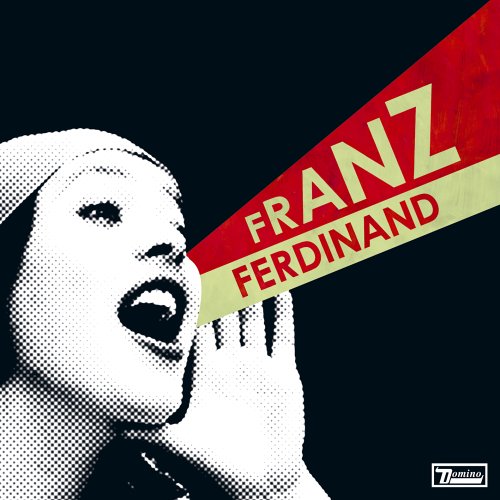
Franz Ferdinand album 'You Can Have It So Much Better'
As a former graphic design student it is very easy to understand the reasons why the movement is so intrinsic to the practice: on studying design, you train yourself to see everything around you in geometric shapes, 'deconstructing' everything to their basic forms. And those basic shapes are in the end the skeleton of a traditional graphic piece - grids, rules, shaped backgrounds. Any hue, images and typography — the organs and skin — tend to turn into chaos without the underneath structure. Obviously there are the practitioners of the antithesis of the movement, aka David Carson.
The question is: Do the images posted above (originally posted on the CR post) illustrate the influence of the movement on current graphic pieces or do they illustrate one of the greatest debates in the creative world: plagiarism. It is quite clear that the second designer 'inspired' his work on the first one. However I guess the album cover does not mean to bring the same political appeal of the Russian poster. Given the title of the album, can we take as an excuse the use of a certain irony? And if so, at what point is this irony clever?
And then I started questioning myself: all my posts are triggered by things I see and read around. I am scanning and browsing things all the time and my brain goes around working as a sponge. At certain point it starts making connections among all these things and there I go, a post. Am I being unethical at some point?
http://www.answers.com/topic/constructivism
http://www.creativereview.co.uk/cr-blog/2008/august/constructivism-the-ism-that-just-keeps-givin
http://en.wikipedia.org/wiki/Constructivism_(art)
Thursday, 18 February 2010
Oktavilla
Wednesday, 17 February 2010
From the things I want to do when I grow up
A group of designers and photographers were invited to visualize the tracks of the first album of Heaven 17. Heaven 17 is a British band from the infamous 80's that I just got to know about the existence in the mid 90's. And because of a film. They play one of my favorite tracks in the Trainspotting soundtrack: Temptation. The song led me to get to know the rest of their work and now, 15 years on, I am very curious to see the results of the designers interpretation that I guess will be above all, very graphic.
The band will perform commemorative gigs and the visualizations will serve as backdrop during the tracks execution. The artists (photographers are also taking part) announced to be working with pure animation, lights and, as expected, typography.
Just a thought

New brand
I ve just seen the rebrand of the Central School of Speech and Drama. According to the principal of the institution 'we wanted something more flamboyant and theatrical'. Still according to him, the old identity was far academic.

Actual brand
I am a big fan of yellow anyway and especially this shade of yellow. It resembles very much "mimosa" that was elected by Pantone the colour of the year in 2009. And I do not have much issues with the stroked typeface that might cause nausea to some designers.
My only critique is the emphasis. I would tend to emphasise 'Speech and drama' instead of 'Central School'.
Trainspotting for kids
And with Tim Burton putting his hands on one of my favorites stories of all times, the buzz around Alice in the Wonderland just tend to increase in the next coming weeks. The British Library is throwing an event by next week and showing off the new display dedicated to the very own first copy of the book. The original was illustrated but nobody else but Lewis Carroll. He actually was a mathematics whose real name was Charles Lutwidge Dodgson.

Lewis Carroll original work, 1862.


Illustrations by Arthur Rackham, 1907.


Mabel Lucie Atwell, 1910.

Gwynedd M. Hudson, 1922
References:
http://www.bl.uk/whatson/events/event104389.html
http://www.bugtown.com/alice/
http://www.exit109.com/~dnn/alice/
http://www.alice-in-wonderland.net/
Friday, 12 February 2010
We are all animals. Are we?
To start with is almost impossible to get rid of the 'wild-west-all-American-conquer-dream' concept used and abused by the brand in the past; and the new concept does not make to it any favours. Now, they decided to go even further down and explore a more primitive approach. Well, that is what it looks like.
The tag line goes: WE ARE ANIMALS. Also in capital letters, but more discreet than the typography used by Diesel. The ads rely more on images showing humans (apparently) in their most primitive state and full of energy celebrating the fact that humans, above all, are animals and should follow their emotions and instincts. Hum... Diesel was saying the same thing, but in a more clever way... As well as making use of better typography and images.
The photography used by Wrangler campaign is so bad directed that the models look so silly and the whole thing is very uninspiring... The 'whatever-material' they used to get the red all over the place looks so artificial that is appalling. And the lesbian trick is more the cliche in the fashion world. So, yes, Wrangler campaign is very primitive.


Friday, 22 January 2010
The Art Alpha_bet
V is for Vincent Van Gogh
This weekend, the Royal Academy of Arts, London, opens its exhibition 'The Real Van Gogh | The Artist and his letters'. What I will hopefully enjoy the most about this show is exactly the dual experience. The letters of the exhibition title refer to the correspondence between the artist and, mainly, his younger brother.
Bedroom in Arles
I always enjoyed to dissect visual things and get to know what is inside, or behind if you prefer, the creator thoughts. I love seeing sketches, plans, roughs, non-approved designs. I find the process itself fascinating. As much as the final piece. In his letters, Van Gogh included several of his studies and sketches that would eventually become masterpieces. 

My relationship with Van Gogh was derived from his use of colours,developed during his French period. More precisely, the shock he produced among complementary hues. "There is no blue without yellow and without orange." is a quote attributed to him. Well, accurate or not the credit, it describes in words the reproduction that adorns my bedroom:![]()
Cafe Terrace at Night
Another piece of his that also warms me up, I learned to like very much after seeing the real thing in Paris.
Noon: Rest From Work (After Millet)
Interesting, I see now, more than the portraits or flowers and sunflowers, the works that most attract me have in common subjects such as resting, free time, pause...
References:
http://www.royalacademy.org.uk/exhibitions/vangogh/
http://www.vangoghgallery.com
http://en.wikipedia.org/wiki/Vincent_van_Gogh
http://www.ibiblio.org/wm/paint/auth/gogh/
Wednesday, 20 January 2010
Carpe Diem
At first I didn t know what to really think about it but the gorgeous photography, the beautiful colour scheme and the bold typography didn t let it pass by unnoticed. Not to mention the tag line: Be Stupid. Or, BE STUPID, in capital letters scream. Or, if you prefer, a capital letter wake up call.
Of course most of the situations depicted are extreme examples of stupidity. And that is actually the beauty of the campaign: the humour. It made me smile and I am sure it will make Diesel consumers smile also.
Fashion labels campaigns do not sell clothes ( any Advertisement student knows that ), they sell life styles. And being silly and not taking things THAT SERIOUS is the best way to get through life. In the end, is all dust…


More @ Diesel.


