
In a nutshell his words are a critique to the way graphic designers in the UK deal with poster as a media. And fail. To all fairness, one has to consider that, as it seems, his opinion target this collection of work sin particular. But, still, it lights up the yellow light.
He goes around a set of poster for the London Design Festival 2009, when a group of high caliber designers were commissioned to design A1 posters to celebrate design in the city.
Some of the posters displays an extreme abstraction of that.
Bibliotheque
Form
Others, somehow made use of cliches quite explicitly (!).
About Creative

Henrik Kubel
Whereas others made is with certain class and poetry.
Browns
Tom Hingston Studio
There is no forgiveness. Apparently none of them made use of the element poster as it meant to be. Accordingly, a poster is meant, firstly, to grab attention in a creative and memorable way and, then, convey a message appropriately to a designated audience. The posters were exhibited during the festival. Now, I wonder: who goes to Design Festivals? Italian tourists lost in Trafalgar Square? High-bonus city boys? No, designers or design related people do. It is very naive to believe that the great public goes to such thing. That said, I guess that some of the posters made sense among the design community. They are for sale at £40 each.
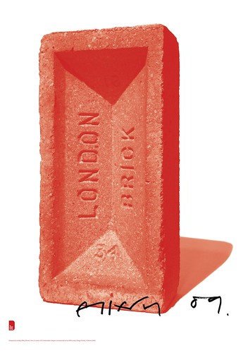
I really like the approach given by Browns. The red/orange brick grabbed my attention instantaneously, kept if for while and when I left it, I had in my mind a very beautiful and sophisticated image of a red brick. That made me visualize it as being the primary element of any construction, the foundation, or, still, all the hard work behind a beautiful piece of design. Ok, that is my interpretation, I don't really know whether that was the message that was supposed to be conveyed.
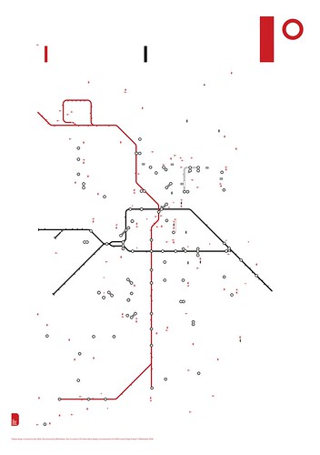
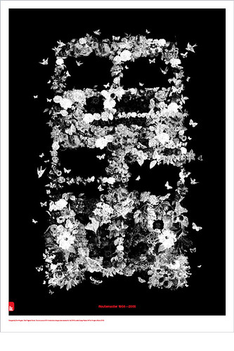
The R.I.P routemaster is poetic. After all, who does not love that London icon design? But what I liked the most was to think about it without seeing it in fact. The visual without visualizing. And the fact that despite the designers were restricted to the use of only two colours (red and black), no red was used to represent the bus.
Beyond that, the article also made me think: how designers and studios deal when approached to deliver such jobs? Some of them seem to have spent certain quality time around it. Others, very little.
And a finish with an appropriate sound track for the matter:
No path to follow - The chemical brothers
References
http://en.wikipedia.org/wiki/Rick_Poynor
http://en.wikipedia.org/wiki/Eye_(magazine)
http://www.londondesignfestival.com/events/london-posters
http://www.londondesignfestival.com/editorials/available-now-buy-posters-london-poster-exhibition
http://en.wikipedia.org/wiki/Poster
http://blog.eyemagazine.com/?p=448
http://www.designhistory.org/posters.html


No comments:
Post a Comment